Scope
Packaging Strategy
Structural Packaging Design
Bottle Design
Packaging Identity
Graphic Design
Typography & Information Hierarchy
Surface & Embossing Concept
Material & Color Direction
3D Visualization
Packaging Mockups
Overview
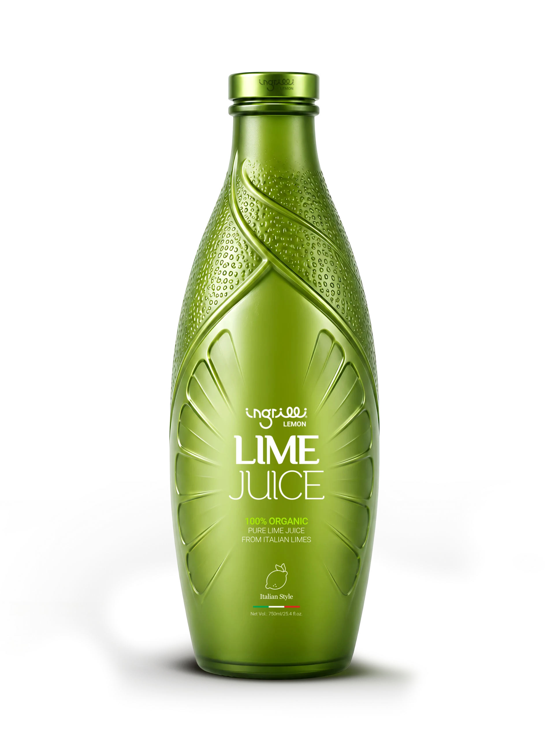
The Lime Juice packaging project was developed around a simple idea: the bottle itself should communicate freshness before the product is even tasted.
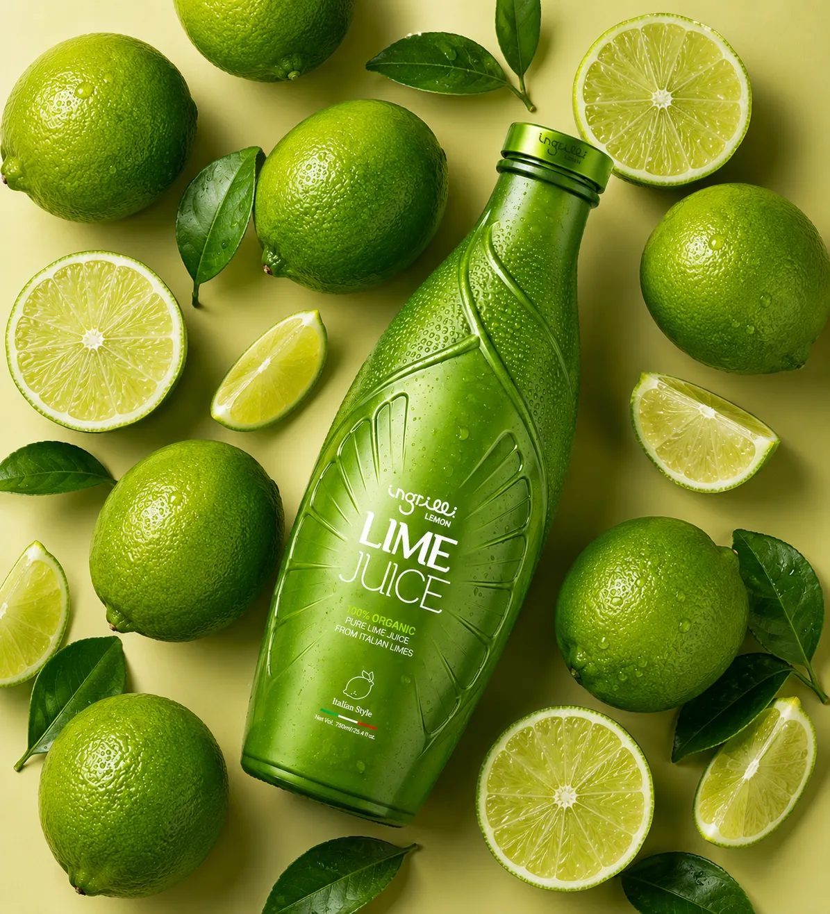
Rather than treating the packaging as a neutral container with graphics applied to its surface, we approached the bottle as a three-dimensional expression of the product.
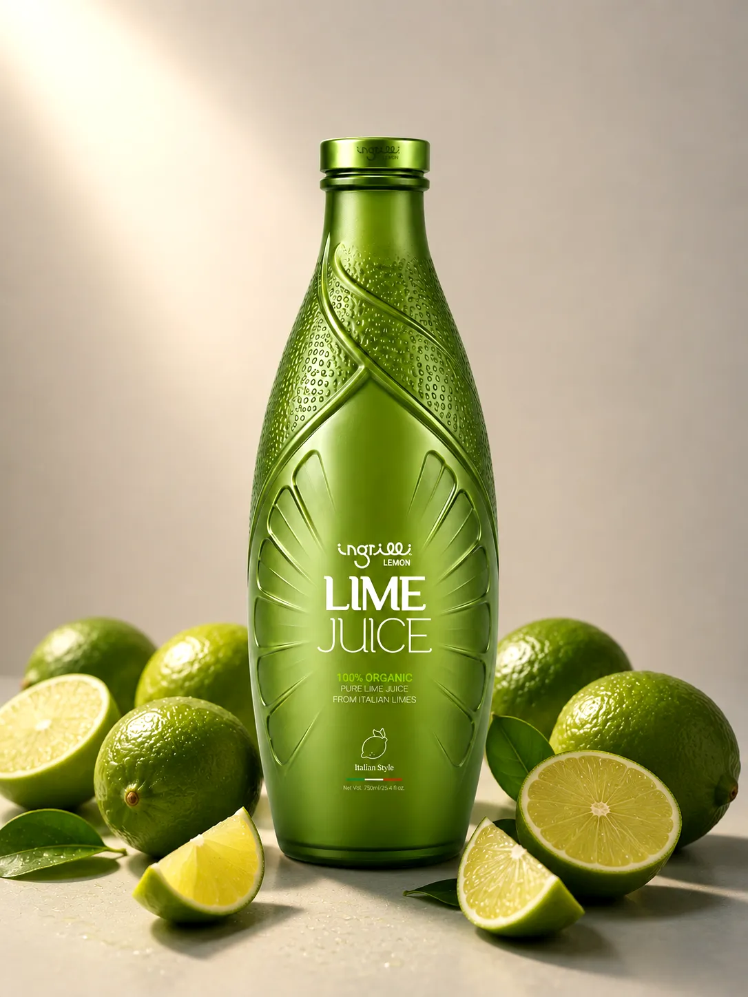
Inspired by the organic geometry of lime leaves, citrus peel, and sliced fruit, the structure was designed to evoke the freshness, acidity, and vibrant character of lime juice through form, texture, color, and touch.
The result is a distinctive packaging concept where product and package feel naturally connected.
The Challenge
Lime juice is a familiar product in a visually crowded category. Many products rely on conventional bottles, illustrated labels, or photographs of citrus fruit to communicate freshness.
The challenge was to create a stronger and more immediate connection between the packaging and the sensory qualities of the product itself.
At the same time, the design needed to feel natural without becoming rustic, and premium without losing the freshness and accessibility associated with citrus products.
Another key objective was to reduce the visual dependence on a traditional label and allow the bottle structure to carry a larger part of the brand identity.
Design Approach
Our approach began with the natural anatomy of the lime.
The upper section of the bottle draws inspiration from overlapping leaves, creating an organic transition from the neck toward the body. Fine surface detailing introduces a tactile quality reminiscent of citrus peel and natural plant textures.
The lower structure references the radial geometry of a sliced lime, translating the familiar segments of the fruit into a sculptural pattern integrated directly into the bottle.
Instead of illustrating the ingredient on the packaging, we incorporated its visual language into the packaging itself.
This allowed the bottle to communicate the product through shape rather than decoration.
Brand Experience
The packaging creates recognition from multiple levels.
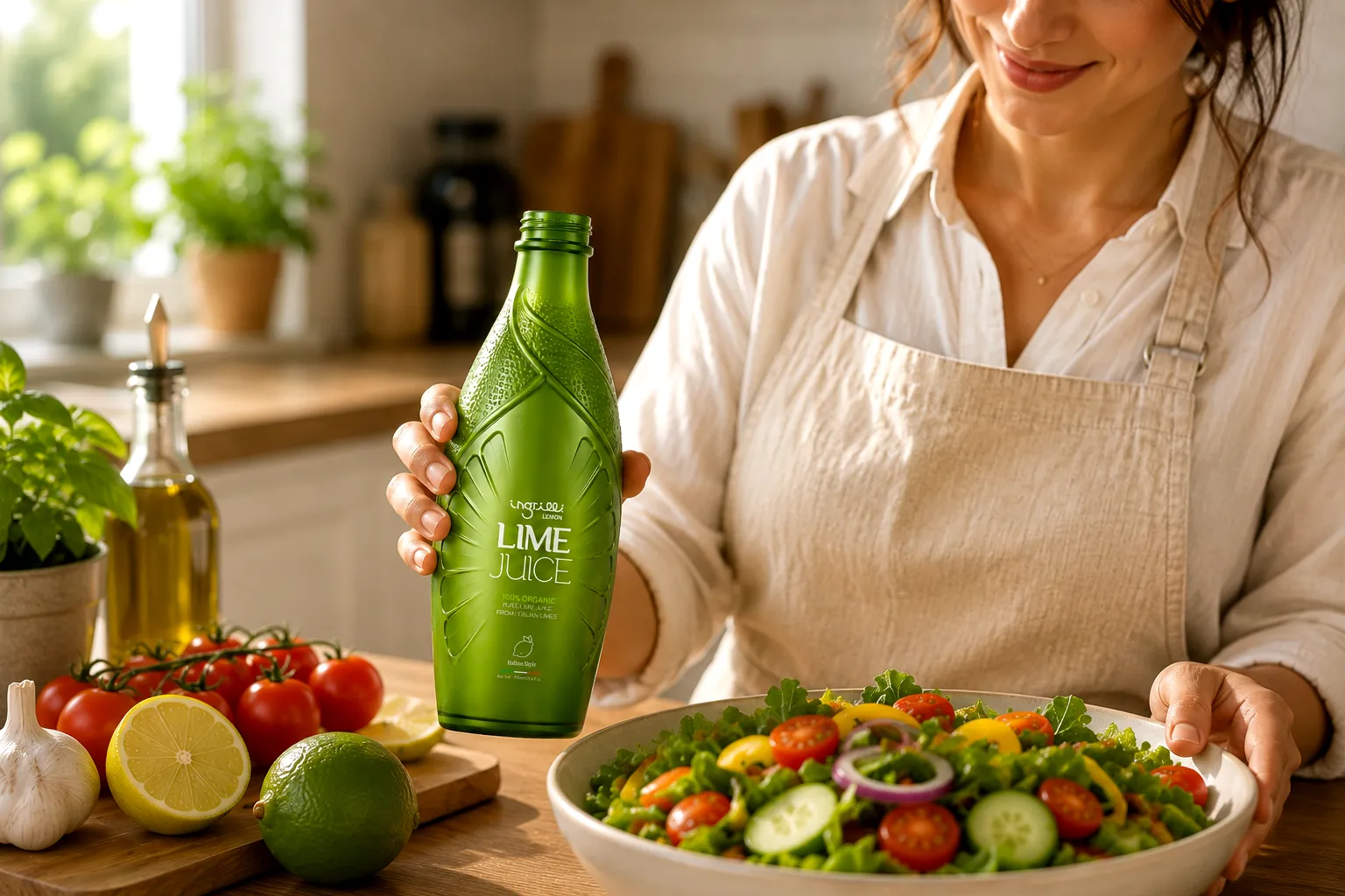
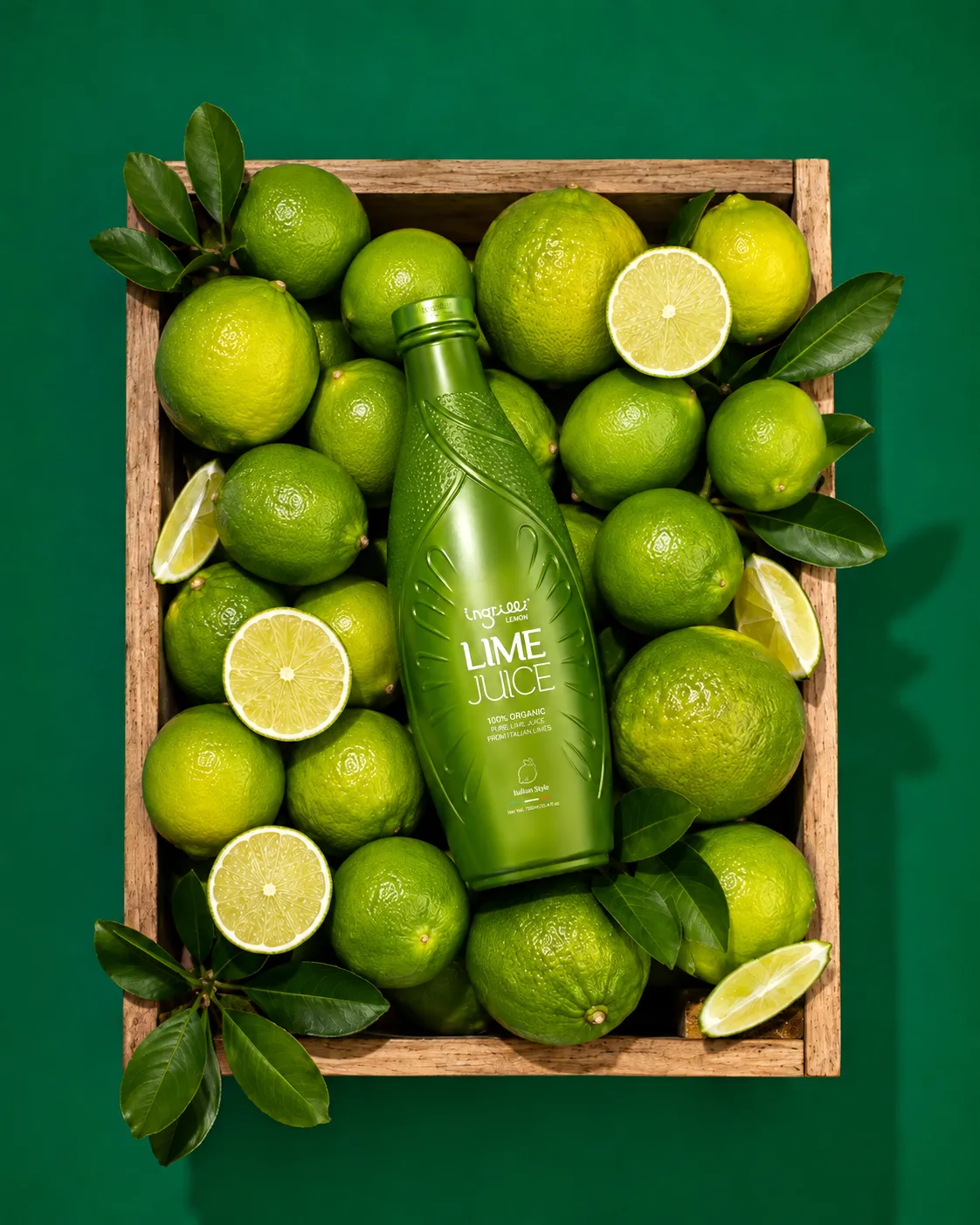
From a distance, the distinctive silhouette and monochromatic green color establish immediate shelf presence.
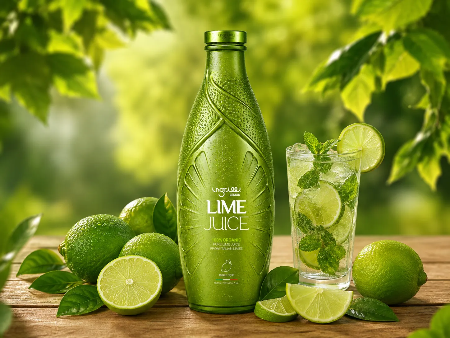
At closer range, the embossed leaf structures and citrus textures introduce additional layers of detail.
And when held, the dimensional surfaces provide a tactile interaction that reinforces the natural inspiration behind the product.
The bottle therefore becomes more than a container or label carrier — it becomes a physical expression of the brand and the ingredient itself.
Outcome
The final concept transforms a familiar lime juice product into a more distinctive and ownable packaging experience.
By combining structural design, natural geometry, tactile detailing, and minimal graphics, the packaging creates a direct relationship between ingredient, flavor, and form.
Rather than simply showing the consumer an image of lime, the bottle itself becomes an interpretation of lime — fresh, vibrant, organic, and immediately recognizable.
Explore our
Recent Projects
Got Questions? We’ve Got Answers
What services does Studio Zimo offer?
We provide branding, packaging, advertising, digital design, content creation, print, motion, and strategic consulting tailored to your brand needs.
How long does a typical project take?
Timelines vary based on scope, but most projects are completed within a few weeks with clear milestones and updates throughout.
Do you work with international clients?
Yes, we collaborate with clients worldwide and manage projects seamlessly through remote communication.
How do we get started?
Simply reach out through our contact form, and we’ll schedule a consultation to understand your goals and begin the process.