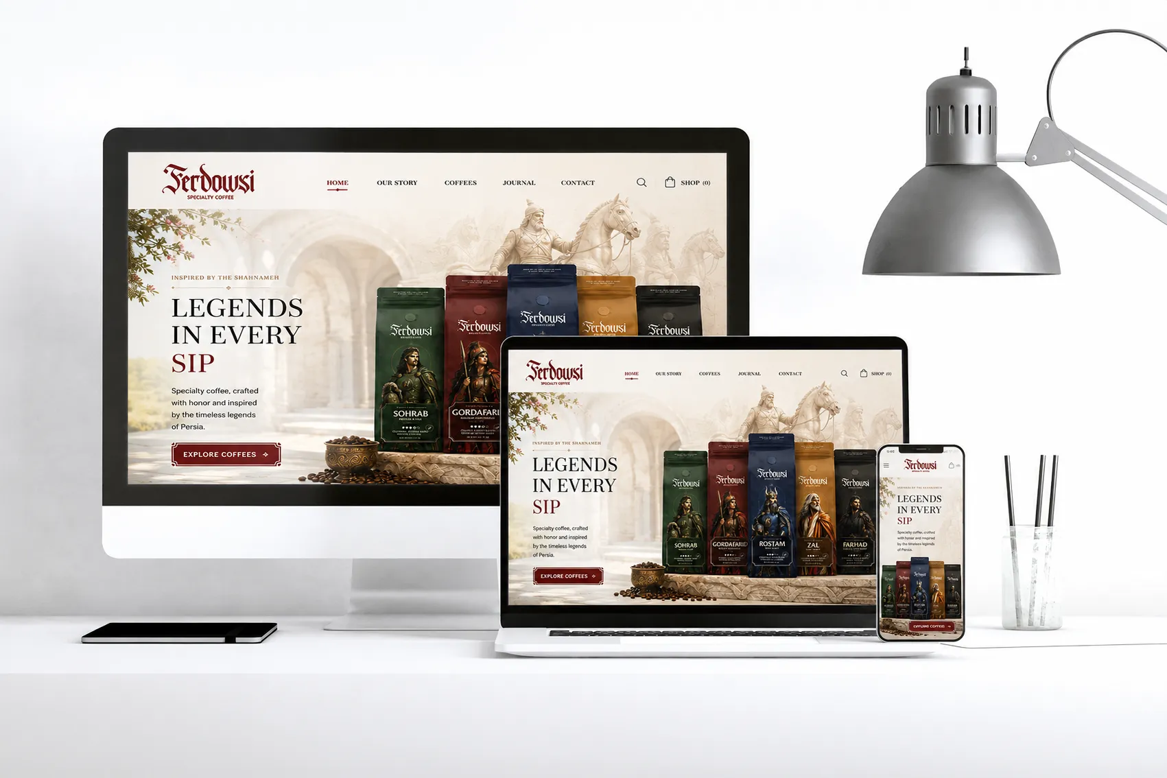
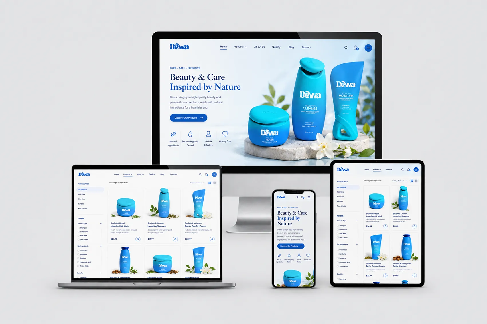
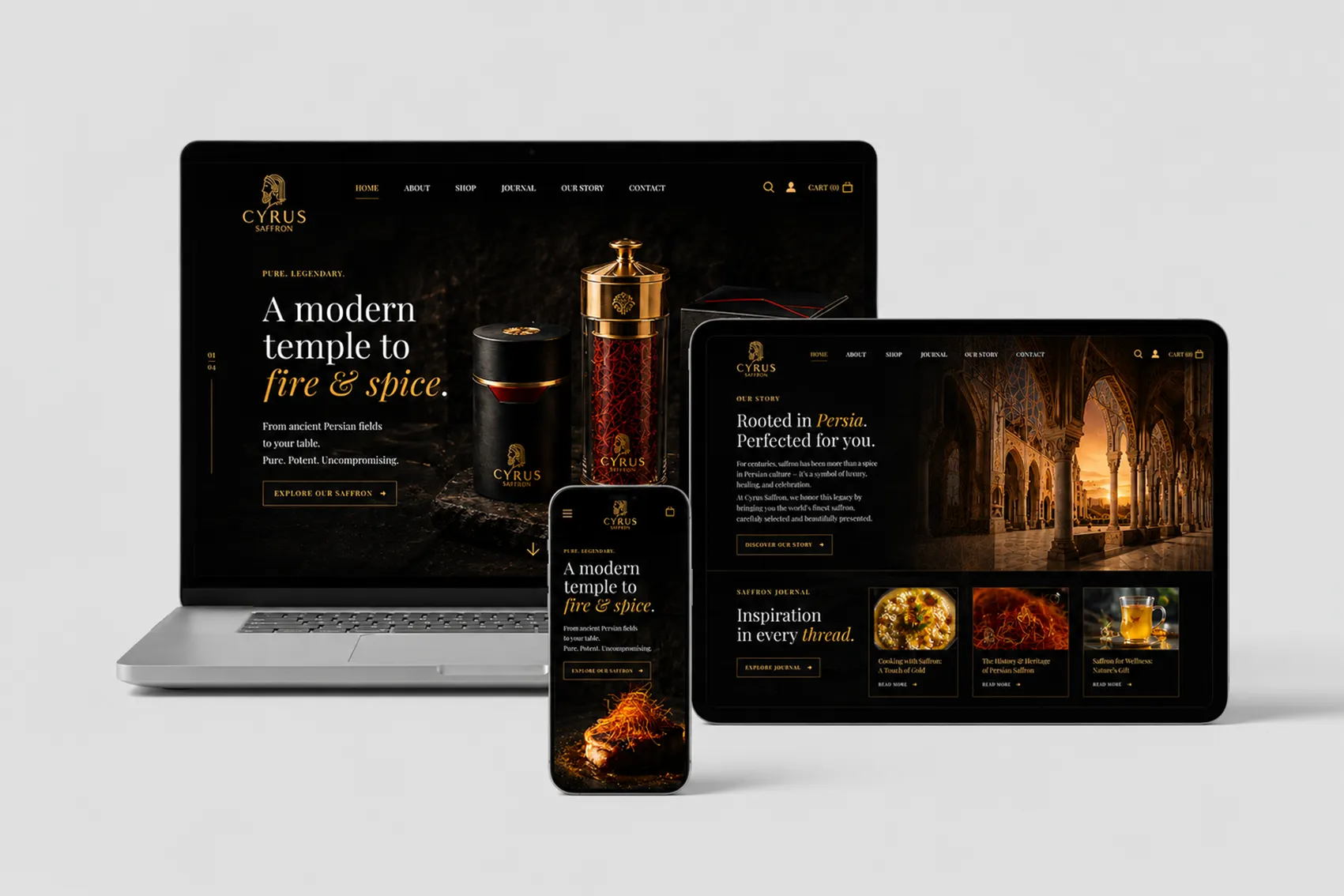
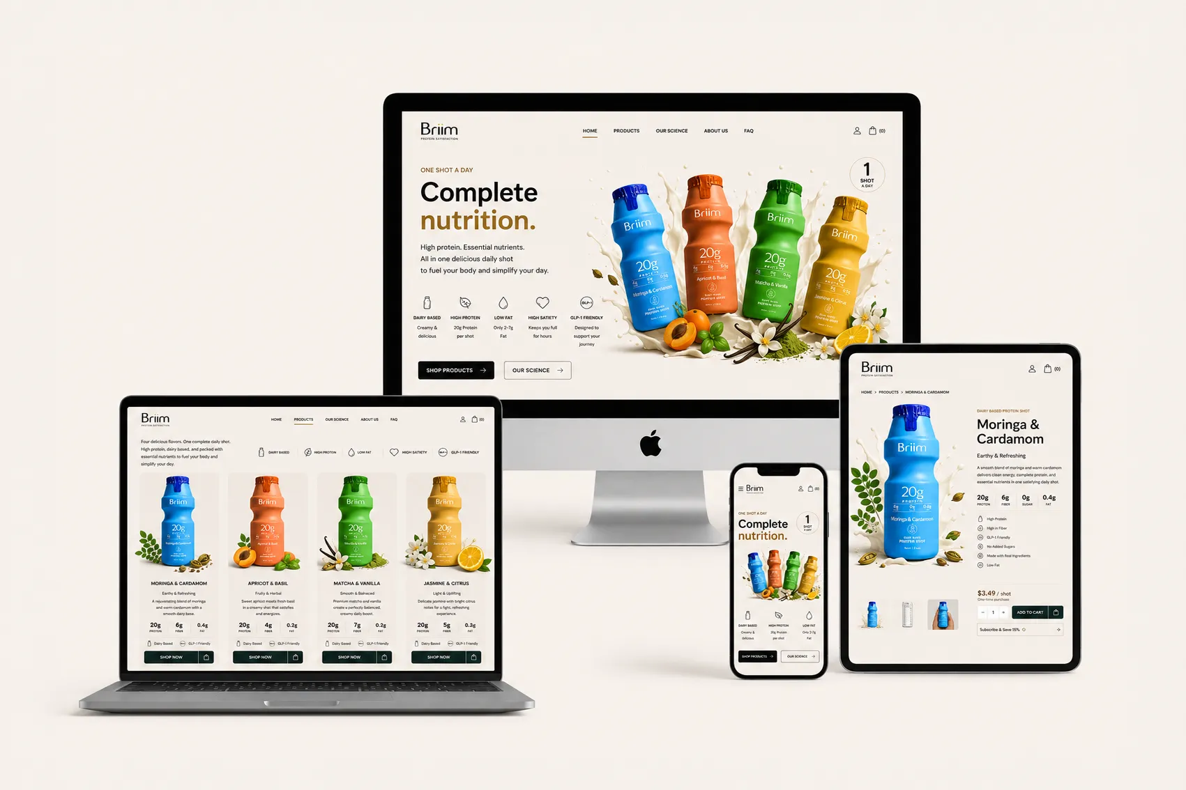
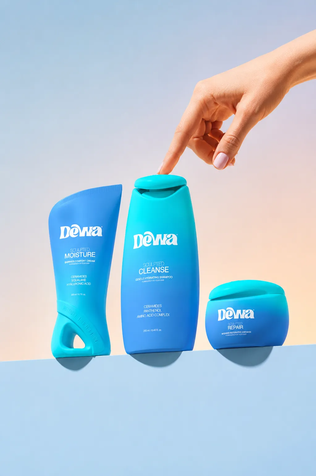
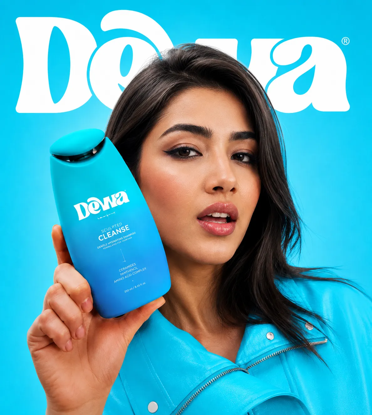
ZIMO transformed our brand into something truly remarkable. Lorem Ipsum is simply dummy text of the printing and typesetting industry.
It has survived not only many decades, but also the leap into electronic typesetting, remaining essentially unchanged.
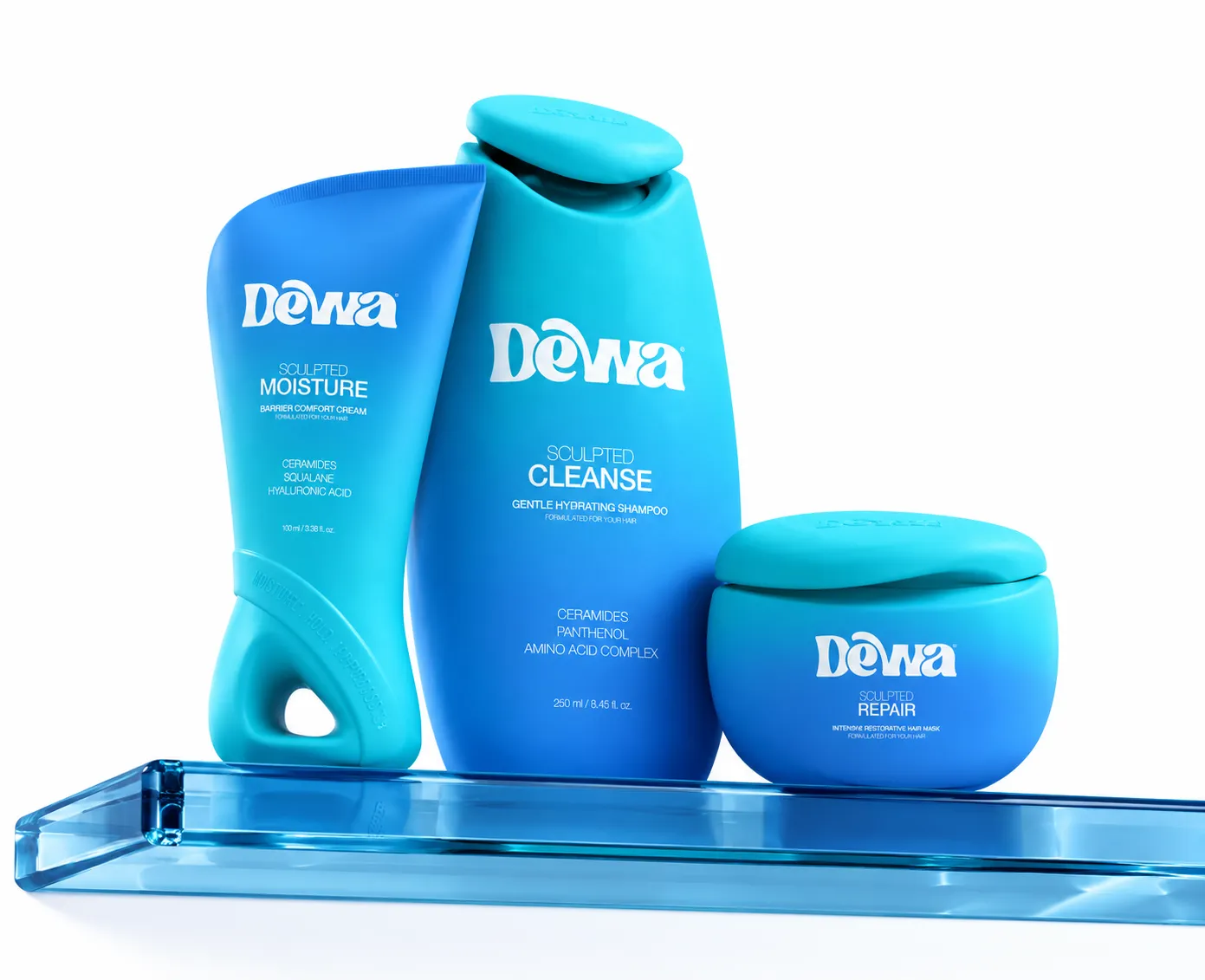
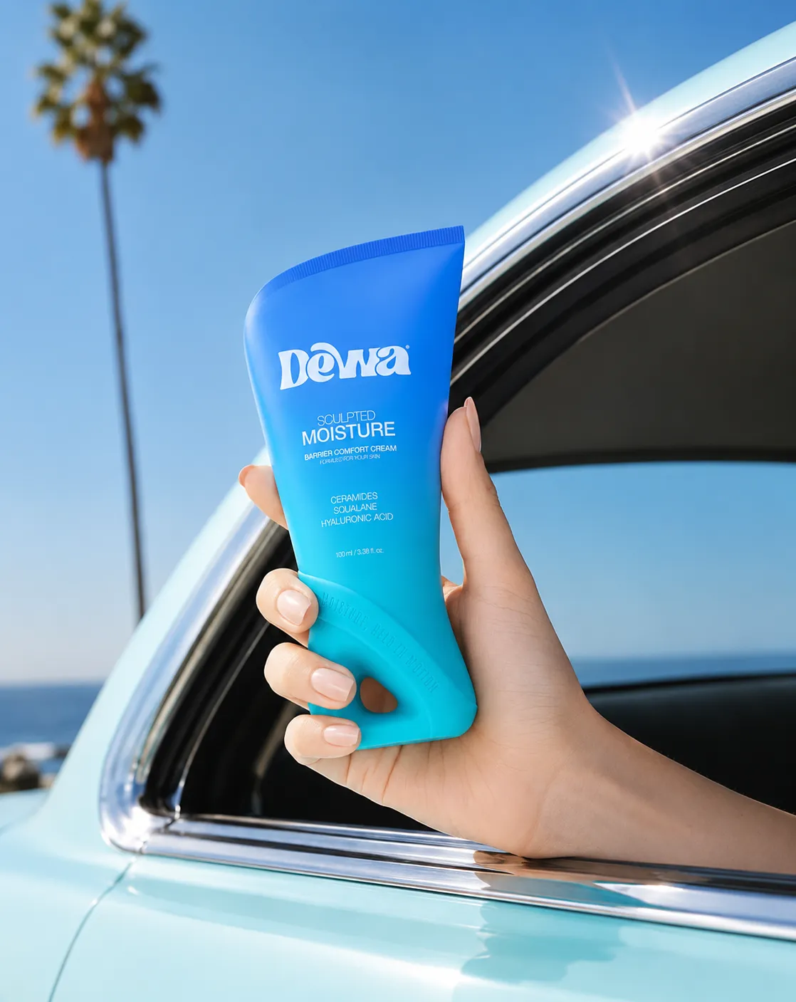
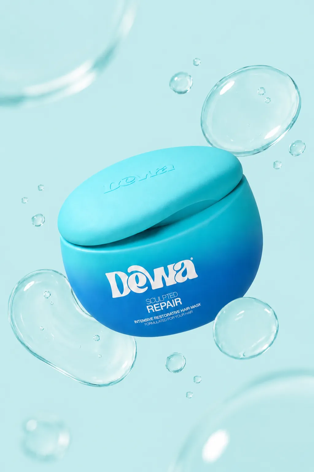
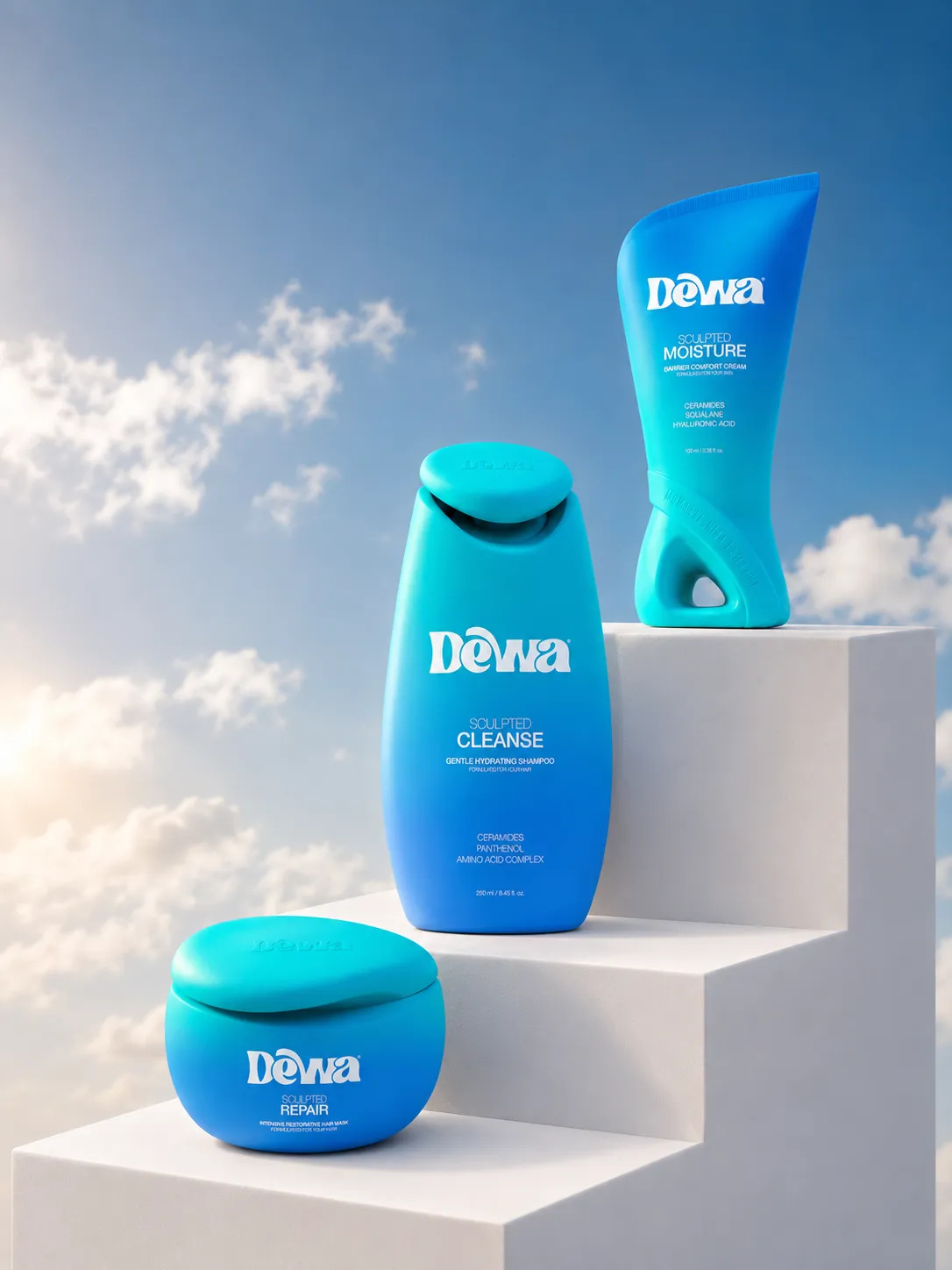
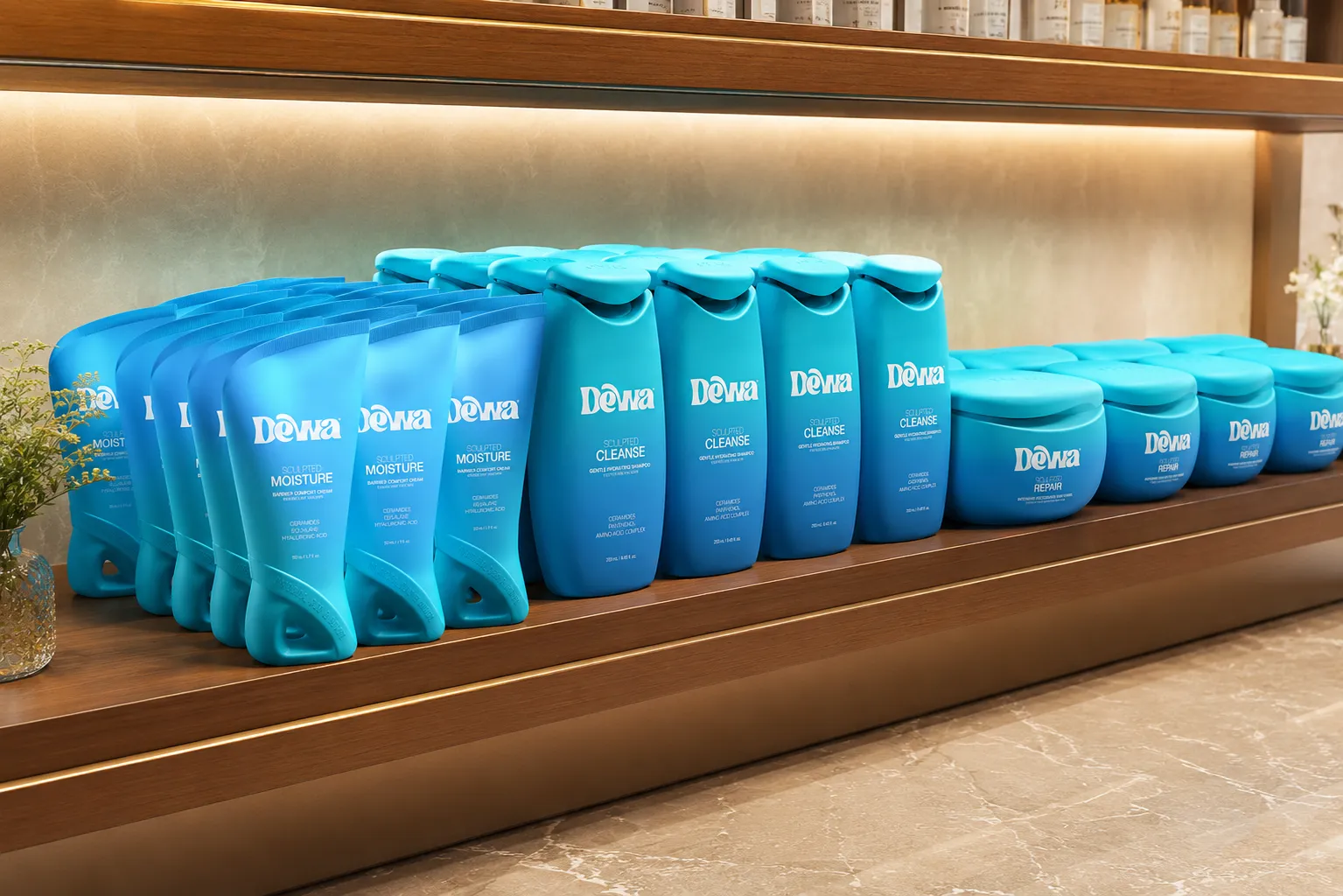
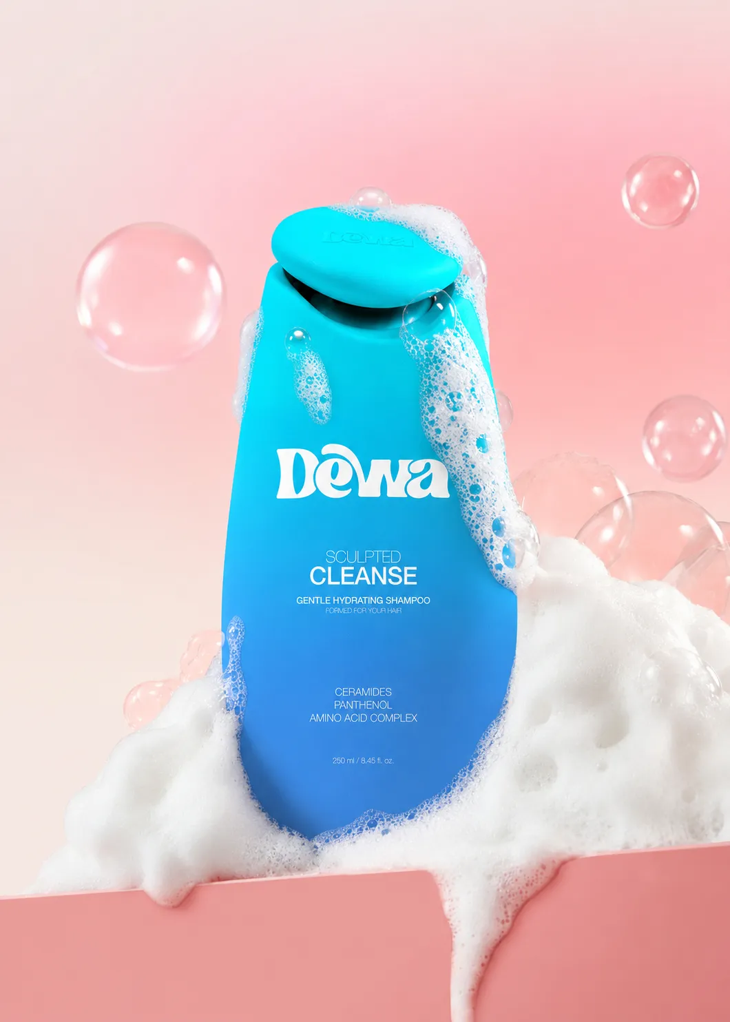
Overview
The Challenge
Design Approach
Brand Experience
Outcome
What Our Clients Say
Honest words from the brands we have served
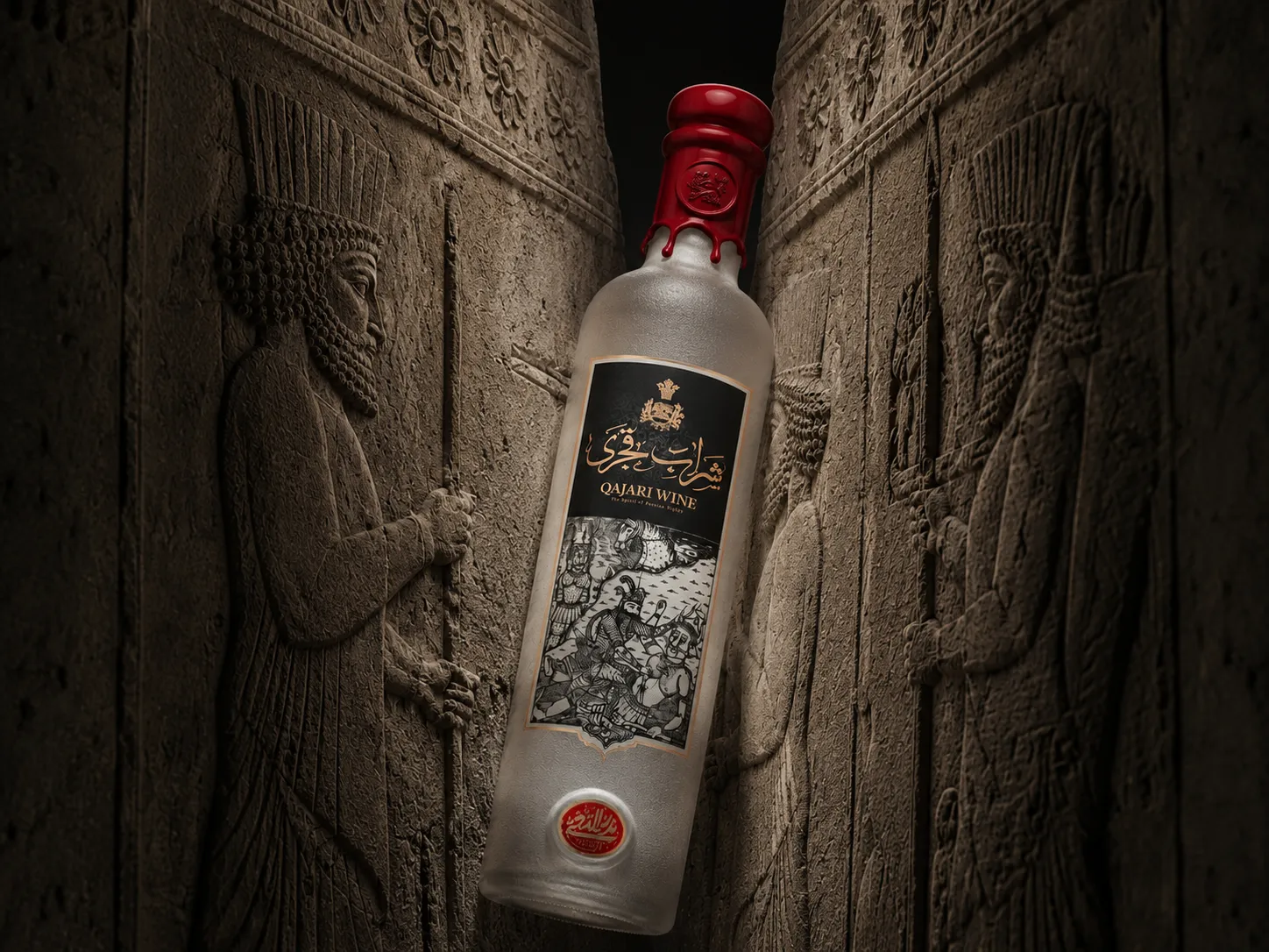
What Our Clients Say
Honest words from the brands we have served

What Our Clients Say
Honest words from the brands we have served
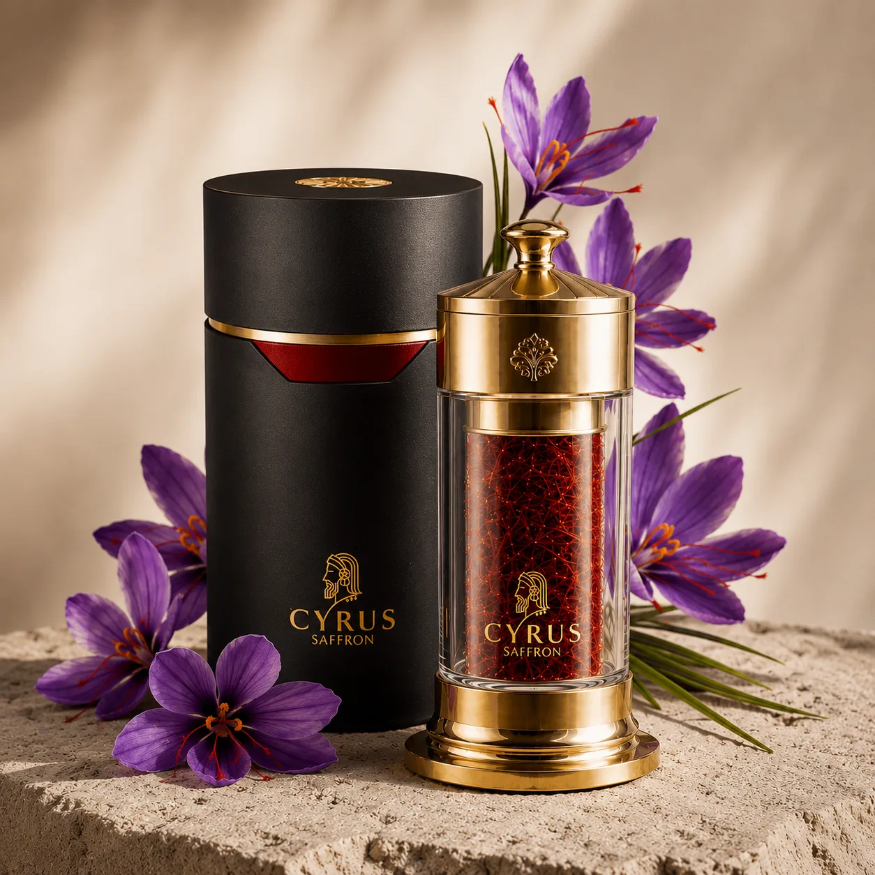
What Our Clients Say
Honest words from the brands we have served
Got Questions? We’ve Got Answers
What services does Studio Zimo offer?
We provide branding, packaging, advertising, digital design, content creation, print, motion, and strategic consulting tailored to your brand needs.
How long does a typical project take?
Timelines vary based on scope, but most projects are completed within a few weeks with clear milestones and updates throughout.
Do you work with international clients?
Yes, we collaborate with clients worldwide and manage projects seamlessly through remote communication.
How do we get started?
Simply reach out through our contact form, and we’ll schedule a consultation to understand your goals and begin the process.