Brand Strategy · Logo Design · Visual Identity · Packaging System · Packaging Design · Product Differentiation · Art Direction · Product Photography · Lifestyle Photography · Mockup Development · Digital Brand Assets
Overview
Katik is a complete poultry branding and packaging project developed by Zimo Studio. From logo design and visual identity to packaging, art direction, and photography, every element was created to establish a fresh, distinctive, and commercially strong presence for the brand.
The Challenge
The primary challenge was to differentiate multiple fresh chicken products while maintaining a unified brand identity. Each package needed to communicate its product category immediately, remain recognizable from a distance, and convey freshness, quality, and food safety within a highly competitive retail environment.
Design Approach
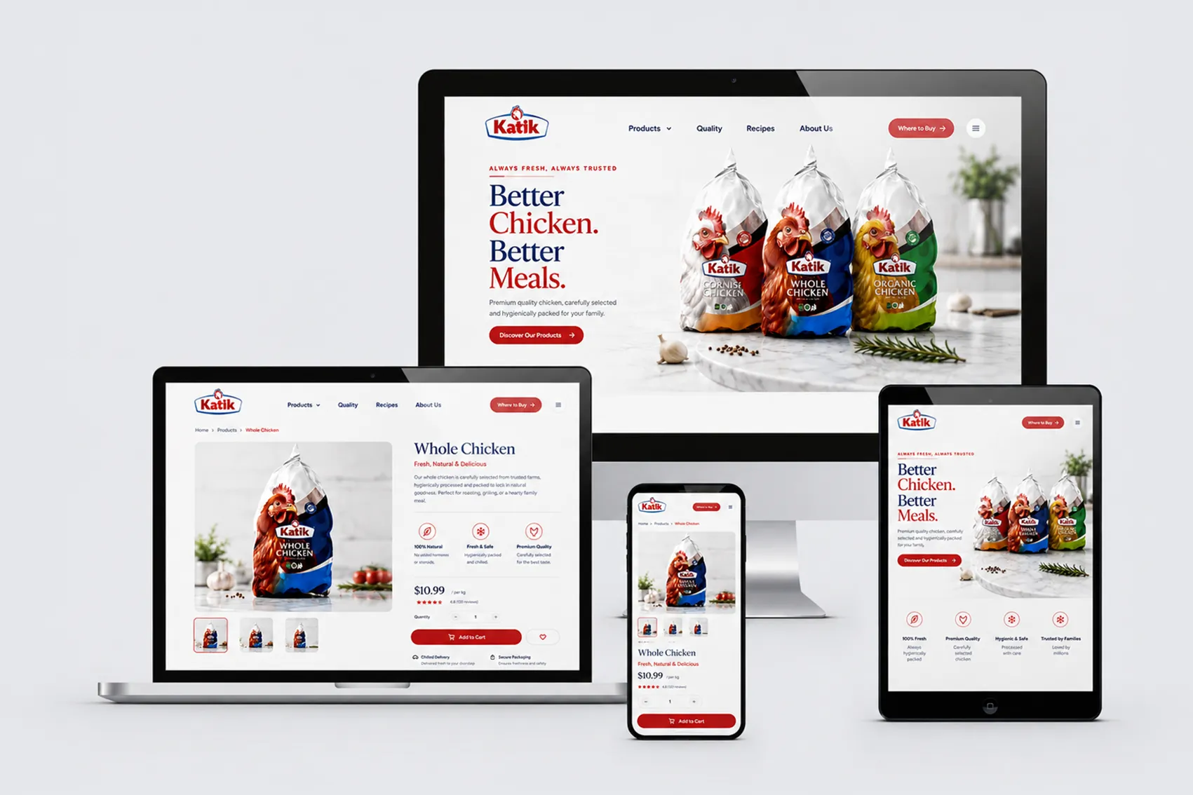
The packaging system is built around a consistent visual structure combined with clear color coding. Red identifies Cornish Chicken, green represents Organic Chicken, and blue distinguishes Whole Chicken. The prominent chicken imagery creates an immediate connection to the product, while the shared layout, typography, logo placement, and graphic curves maintain consistency across the complete range.
Brand Experience
Katik’s visual language balances bold retail impact with a clean and trustworthy presentation. Vibrant colors help customers navigate the product family quickly, while realistic poultry imagery and glossy packaging details reinforce freshness and product quality. Lifestyle and commercial photography extend the identity beyond the shelf, presenting each product within relevant home, professional kitchen, and refrigerated environments.
Outcome
The result is a cohesive and expandable packaging system that gives every product a distinct identity without fragmenting the brand. The system can support future product variations by introducing new color combinations while preserving the established layout and visual hierarchy. Together, the identity, packaging, and photography create a consistent brand experience across retail displays, digital platforms, advertising, and social media.
ZIMO transformed our brand into something truly remarkable. Lorem Ipsum is simply dummy text of the printing and typesetting industry. It has survived not only many decades, but also the leap into electronic typesetting, remaining essentially unchanged.
ZIMO transformed our brand into something truly remarkable. Lorem Ipsum is simply dummy text of the printing and typesetting industry. It has survived not only many decades, but also the leap into electronic typesetting, remaining essentially unchanged.
ZIMO transformed our brand into something truly remarkable. Lorem Ipsum is simply dummy text of the printing and typesetting industry. It has survived not only many decades, but also the leap into electronic typesetting, remaining essentially unchanged.
ZIMO transformed our brand into something truly remarkable. Lorem Ipsum is simply dummy text of the printing and typesetting industry. It has survived not only many decades, but also the leap into electronic typesetting, remaining essentially unchanged.
 Skip to content