Redhot Sachet

Redhot Sachet
Date : July 24, 2026

Scope

Packaging concept and creative direction
Structural packaging design
Chili-inspired form development
Product family architecture
Flavor differentiation and color system
Front-of-pack graphic design
Typography and information hierarchy
Transparent sauce-window integration
Tear, grip, and dispensing experience
Material and thermoforming visualization
Photorealistic product rendering
Exploded-view and technical presentation
Food styling and lifestyle mockups
Presentation design for portfolio and digital platforms

Overview

This project explores a new approach to single-serve hot sauce packaging by transforming the natural form of a chili pepper into a distinctive, functional sachet. Rather than relying on the conventional flat rectangular format, the packaging was designed as a three-dimensional object with a recognizable silhouette, strong shelf presence, and a more engaging user experience.

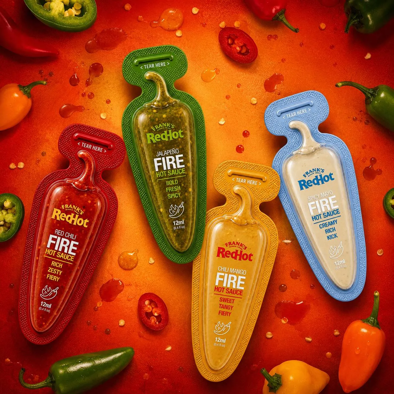
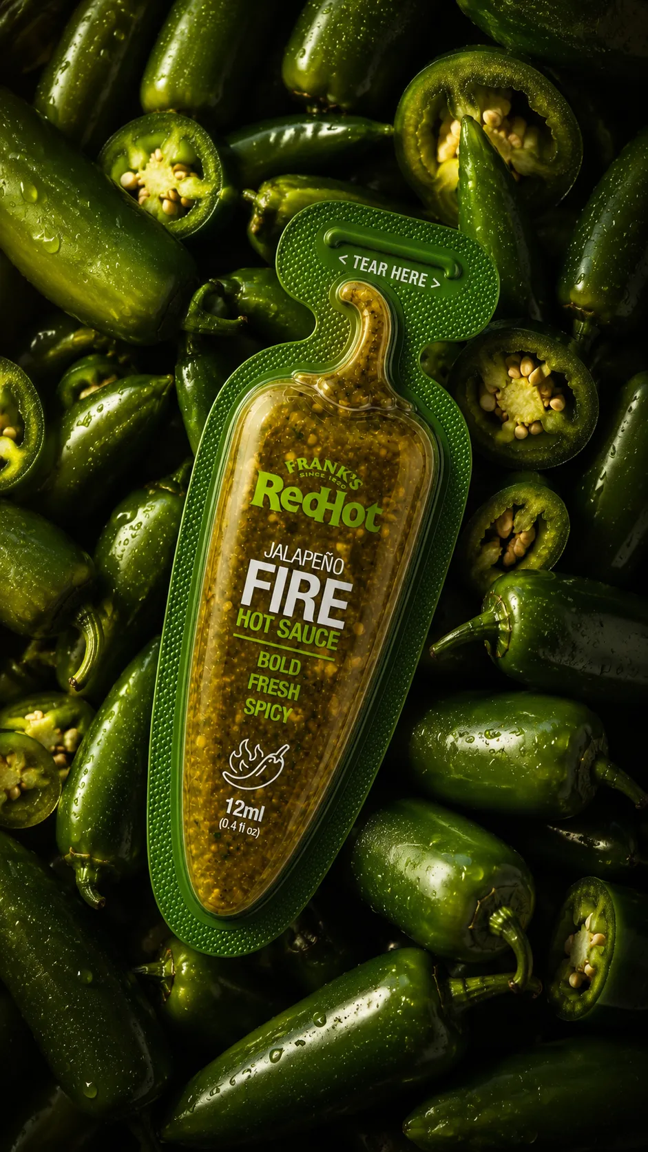
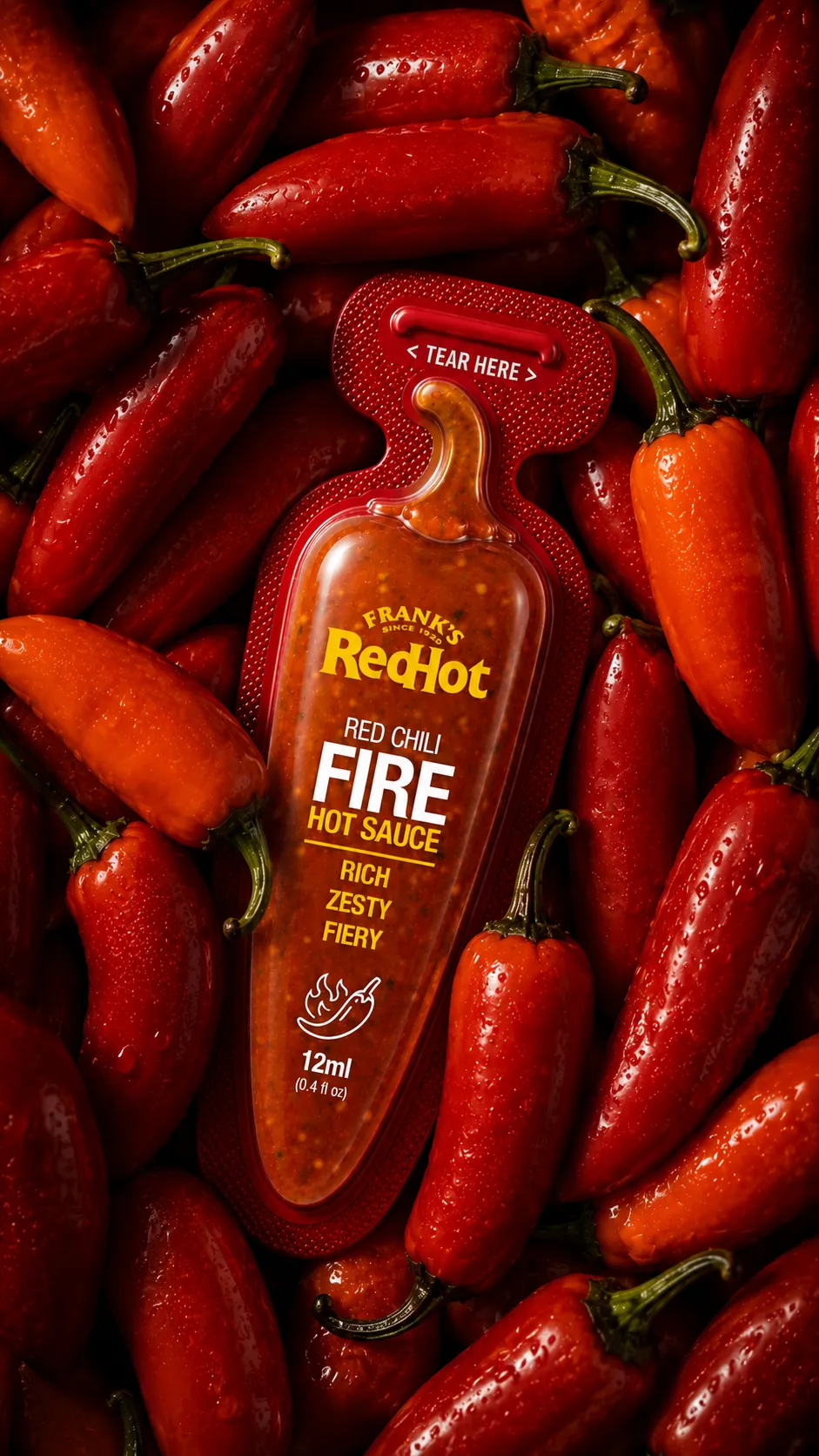
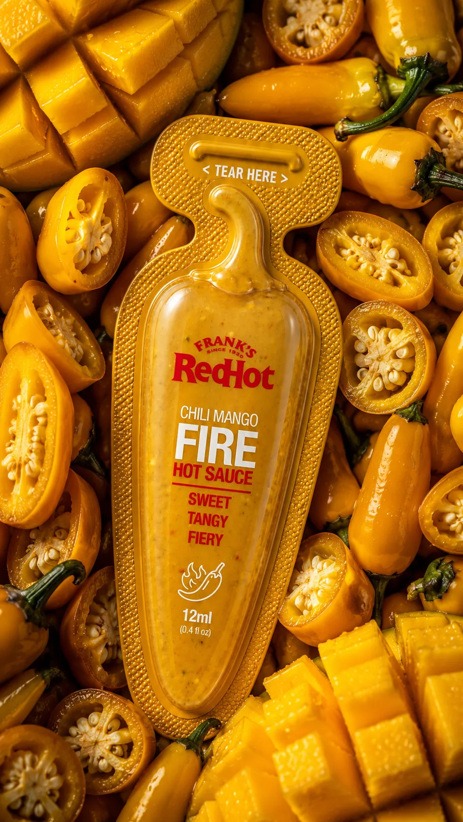
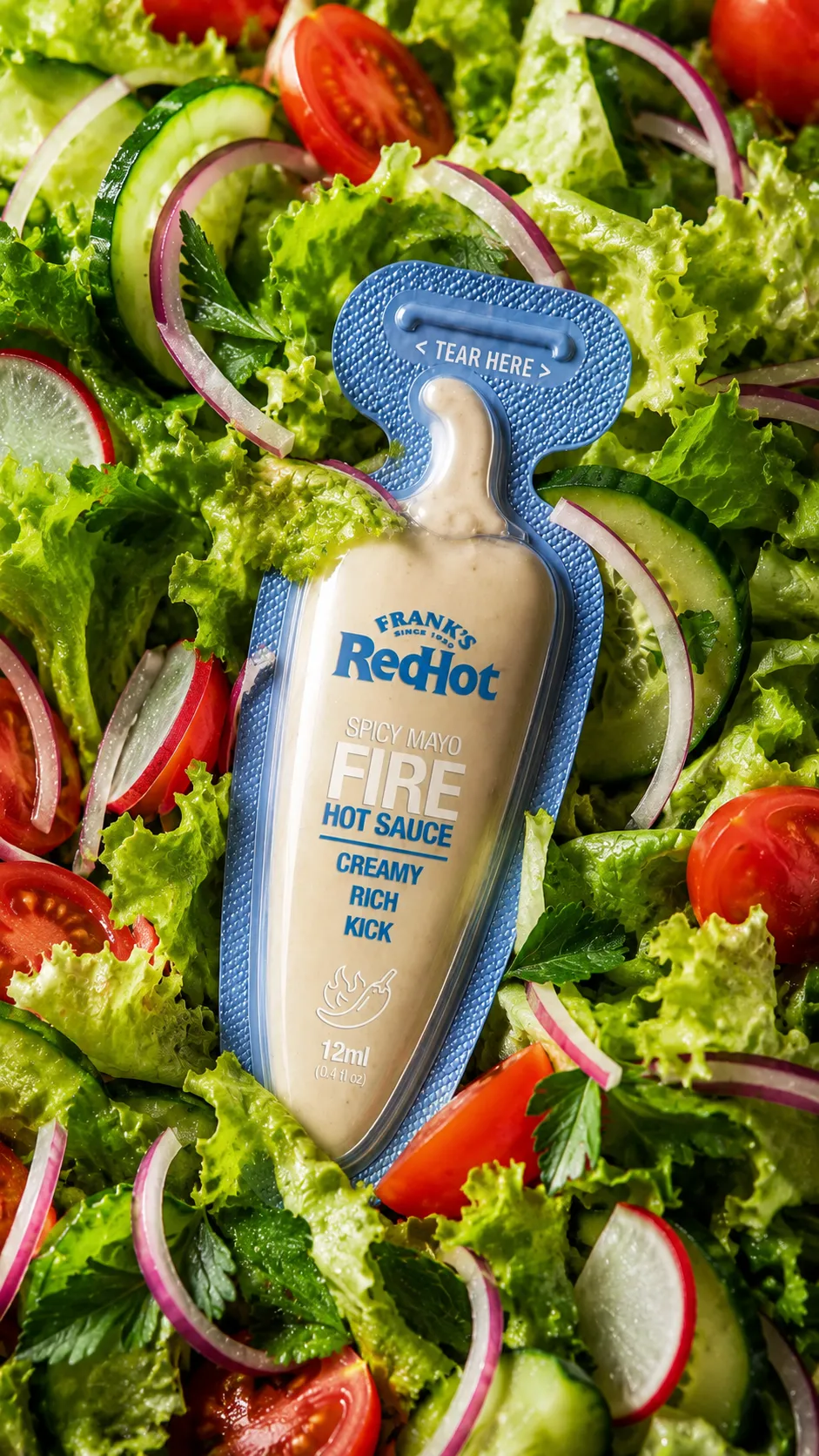
The collection includes four flavors—Red Chili, Jalapeño, Chili Mango, and Spicy Mayo—unified through a consistent structural language while using color, sauce texture, and typography to create clear differentiation across the range.

The Challenge

Traditional condiment sachets are often visually generic, difficult to handle, and dependent almost entirely on printed graphics for differentiation. The challenge was to develop a package that could immediately communicate heat, flavor, and product character while remaining intuitive and convenient to use.

The design also needed to balance two equally important priorities: visual impact and practical performance. The final form had to feel original and premium without sacrificing ease of opening, controlled dispensing, comfortable handling, or efficient portioning.

Design Approach

The design process began with the natural anatomy of a chili pepper. Its elongated body, tapered tip, and curved stem were simplified and translated into a distinctive packaging silhouette. The pepper shape was not treated as a decorative reference alone; each part of the form was developed to support the function of the sachet.

The transparent thermoformed chamber allows the color, consistency, seeds, and natural texture of each sauce to remain visible. A textured perimeter creates a more tactile grip, while the extended upper section provides a clearly defined tear zone. Once opened, the curved stem becomes the controlled dispensing point.

Color coding was applied to the structural frame of each sachet, creating a unified product family while allowing every flavor to maintain its own identity. The graphic hierarchy was kept bold and direct, making the flavor, heat positioning, and product benefits easy to recognize at a glance.

Brand Experience

The result is a more expressive and interactive condiment experience. The chili-inspired silhouette immediately communicates the product category, even before the consumer reads the label. Its transparent window turns the sauce itself into an important part of the visual identity, reinforcing freshness, authenticity, and appetite appeal.

The packaging is designed to feel tactile, playful, and premium. Its sculpted form stands out in restaurant settings, delivery meals, retail displays, and branded food-service environments. Across all four variants, the system creates a consistent family while offering a distinct sensory expression for each flavor.

Functionality and beauty were considered together throughout the project. The package is visually memorable, but every structural element also contributes to gripping, opening, squeezing, and dispensing the sauce with greater control.

Outcome

The final concept reimagines the single-serve sauce sachet as a recognizable branded object rather than a disposable graphic surface. The natural pepper form creates a strong visual connection to the product, while the transparent sauce chamber, tactile finish, and tear-and-squeeze mechanism enhance usability.

The collection achieves a balance between natural inspiration, structural innovation, and practical performance. It delivers stronger differentiation, improved shelf impact, clearer flavor navigation, and a more memorable consumer interaction across food-service and retail applications.

Explore our
Recent Projects

Got Questions? We’ve Got Answers

What services does Studio Zimo offer?‏

We provide branding, packaging, advertising, digital design, content creation, print, motion, and strategic consulting tailored to your brand needs.

How long does a typical project take?

Timelines vary based on scope, but most projects are completed within a few weeks with clear milestones and updates throughout.

Do you work with international clients?

Yes, we collaborate with clients worldwide and manage projects seamlessly through remote communication.

How do we get started?

Simply reach out through our contact form, and we’ll schedule a consultation to understand your goals and begin the process.

Let’s BUILD
Something GREAT.

Tell us about your project and let’s create
something exceptional together.

Start a Project